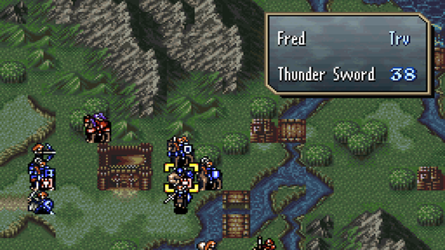
When selecting a partner in the Trade command, "Trv" is now displayed to the right of the unit name when the targeted unit is an accompanying unit.

Trv is the state that 2 units are overlapped in 1 square, it was unclear at first glance which unit was carrying the other unit when the cursor was moved in the exchange. This change clarifies this.
Some people might say that this is something the player just has to remember, so I'll write this in advance: the job of UI is to eliminate such elements that have to be remembered, so I had them do the work. If all you have to remember, it shouldn't have to display the unit name of the trade partner and the item list, but no one would say that's unnecessary. That's what I mean.

