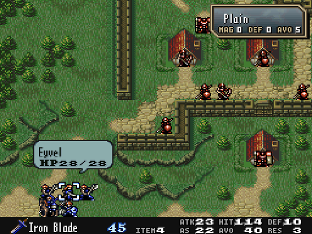
I added the function to display equipment and combat stats information at the screen bottom when hovering over a unit on the map.

Explanatory Video
The video is in Japanese audio but with English subtitles.
Specifications
The specifications are as follows:
- If the unit equips with a weapon, the name of the weapon is shown.
- If the unit has no equippable weapons, allies will be shown the name of the available staff that is at the top of the item list. Enemies and NPCs will be shown the name of the available staff that has the highest weapon level.
- If the unit has more than one item, the number of items in their possession is also displayed.
- It displays the same values as the Atk, AS, Hit, Avo, Def, and Res shown in the upper right corner of the stats screen.
- This information column is treated as part of the unit window (balloon), so if the unit window is not displayed, this information column will not be displayed either.
- For processing reasons, it is not displayed while units are being rearranged on the Preparation screen.
There was an issue with a unit icon disappearing when this information was displayed and units were rearranged. Since the memory used to conflict with the unit rearrangement, I changed it so that the information is no longer displayed during the rearrangement.
Regarding the staff display, there are enemies with Heal in the 1st item column and Physic in the 2nd, etc. At this case, there is no advantage to displaying Heal, so the weapon with the highest level is displayed. Since the allies' items should be arranged by the player with an intention, I made them follow the order of the item list.
Other changes
Related to this function, speeded up the display of the unit window (waiting process is removed).
And I fixed a vanilla bug I discovered while testing this feature, where the terrain window would not appear if you pressed R to open the map menu after all your units had finished their actions, and then B to close it.
Why is it possible to place information there?
In the 1999 environment (CRT), the edge of the screen was generally considered a non-display area that was cut off by overscan, so this screen layout was not possible when Thracia 776 was released.
A brief explanation of overscan is that it is a process that slightly enlarges the input video image. It is said that at that time, there were disturbances at the edges of analog video images, and it was assumed that these areas would be cut off and displayed.
Therefore, there were cases where the outer edges of the image could not be seen. Approximately 90-95% of the original image is called the safety zone, and that the area outside of this zone may overflow outside of the screen and become invisible, depending on the display environment. If only 95% of the area were visible, it would look like this:

In today's environment, we don't need to be concerned about that. Even if you were to run it on an actual device (on an LCD screen), it should look all area. Think of it like the increased information you get when you run FEH on a vertical smartphone.
Acknowledgements
I used Zane’s FE5 QOL (Equipped item preview) for part of the processing in this function. Thank you very much.

